New Spot Creation Flow
Client
Screening Eagle
Services
Visual Design UI & UX Design
Industries
Construction, Civil Engineering
Impact
Avg. 91% completion rate for spot creation
Background
Framing the Problem
Multiple entry points causing decision fatigue: Users can either long press to create a spot or tap the camera icon to snap a photo spot. They are sometimes confused about the difference between the 2 ways of creating spots.
Missing source of truth for spot data: Spots and photos are stored in different destinations - spots in the spot list and photos in the gallery. Users are often unsure where to find their spot after a photo is taken - "Where are my photos stored?"
The Goal
The goal was to make spot creation simple and intuitive so that users of any level could create a spot and know where to find the data. Here are some early considerations around the approach:
Be easily scalable to accommodate different types of spots in the future
Increase users' quality of life without being a disruptive change
Flexible enough to encompass various "modes" - Manual Capture, Assisted Capture, 360° Device connected
Work well across all devices - iPad, Mobile and Desktop

Design Explorations
Taking cue from platforms such as Youtube, Linked and Google Drive, we knew that the entry point for spot creation had to be streamlined into a clear singular path.
A prominent "+" primary action button seems to be the tried-and-tested interface synonymous with data creation. Referencing this familiar mental model as a starting point, I proposed 3 early approaches for user testing.
Option 1: Floating "+" button with an expandable toolbar
Option 2: Floating "+" button with a sheet that slides up
Option 3: Slidable quick action buttons on the home screen


Findings from Testing
I tested with a group of internal users consisting of colleagues from our in-house civil engineers and others who are new to the product. Here are some insights:
The "+" button appears to be an intuitive entry point: Most users, even those unfamiliar with the product, tap on the "+" button as their primary action
Last-marked location can be helpful for users to orientate themselves quickly: The existing workflow always places a new spot on the centre of the floorplan by default. In reality, users would be creating spots sequentially as they go through a particular route on the floorplan.
Old behaviour should be kept as a fall-back: Users who are already used to the existing behaviour of long-pressing to create a spot still default back to the old behaviour. It would make sense to retain this interaction to make it a more friendly transition.
Handling Scope Creep with Rigor - Focus on "Must-haves"
Before identifying the key user flows to fix, I also performed a heuristic evaluation on a few adjacent spot creation flows, including:
Adding 360° photo spots
Creating a spot after live map calibration
A testing session with the civil engineering team revealed several pain points. For example:
When reviewing 360° photos in the app, an accurate orientation of the photo can be very helpful, it should always correspond to where the camera is pointing.
Even though we have a "capture" button after the 360 camera is connected, the user can only capture a photo by directly pressing on the button on the camera itself.
Instructions for map calibration are unclear and confusing for a new user with no clear stepper or sticky headers for instructions.
At this point, the no. of things to be fixed "urgently" started growing and we had to be clear on the requirements to create a minimum lovable feature. I aligned the team on the final requirements based on the "must-haves" and "nice-to-haves" for the new spot creation flow.
Outcome
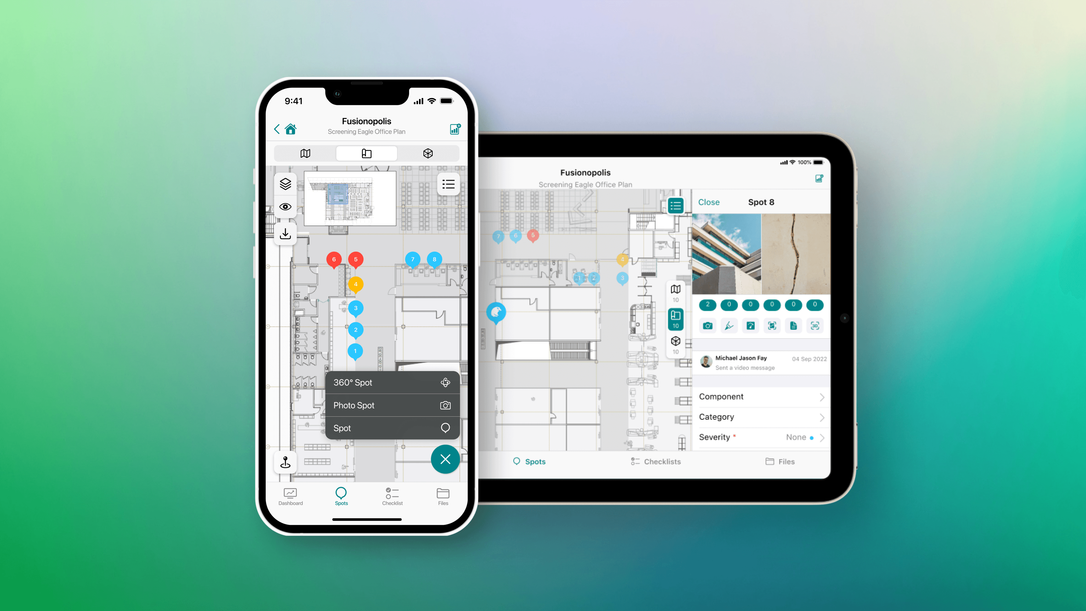
In the final design, we went with the expandable toolbar (Option 1) with a minor tweak to add labels for the icons as icons were not immediately intuitive to new users. When a user taps on the "+" button, they will be prompted to choose from a spot menu - Spot, Photo Spot or 360 Spots.
In the new flow, the spot riflescope will always be placed on the last-marked location so inspectors can easily orientate themselves against the floor plan. Finally, we will also be providing immediate visual feedback after a spot is successfully created with a toaster that appears on the bottom of the screen.
The final approach was implemented across all platforms - mobile, iPad and web.

What Success Looks Like
Since the release of the feature, here are some primary indicators of good traction:
Avg. 91% completion rate for spot creation: One of the core indications of user engagement is the volume of spots created for an asset. The spot creation flow is one of the top 3 most common events for the product.
Tapping on "+" a primary interaction: Confusion around the entry point for spot creation has reduced. We have noticed the "+" button becoming a default action for new users onboarding onto the product.
© 2024 All Rights Reserved.
Made with